
In today’s digital world, thumbnail design is not optional—it’s essential. Whether you are a YouTuber, blogger, or social media creator, your thumbnail decides if people click or scroll past your content.
Creating a strong thumbnail design is a skill that combines creativity, psychology, and strategy. This guide will show you how to create thumbnail designs that attract attention and increase clicks.
Why Thumbnail Design Is So Important
Your thumbnail is the first thing people see.
Before reading the title or description, users judge your content by the thumbnail alone. A well-designed thumbnail can:
- Increase click-through rate (CTR)
- Improve video and post performance
- Build brand recognition
- Make your content look professional
Simply put, better thumbnails bring more traffic.
What Makes a Good Thumbnail Design?
A successful thumbnail design has a few core elements working together.
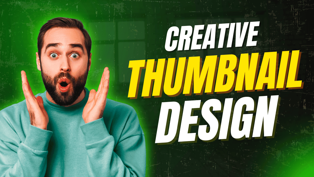
1. Clear Visual Focus
Your thumbnail should have one main subject, not multiple distractions. Faces, objects, or text should be instantly noticeable.
2. Bold and Readable Text
Use big, bold fonts that are easy to read on mobile screens.
Best practice:
Limit text to 2–5 words.
3. High Contrast Colors
Strong contrast between background and text makes your thumbnail stand out, especially in crowded feeds.
Avoid dull or similar colors that blend together.
4. Emotional Connection
Thumbnails that show emotion perform better. Expressions like excitement, curiosity, shock, or happiness grab attention quickly.
People click feelings before logic.
How to Create Thumbnail Design Step by Step
Step 1: Understand Your Content Goal
Ask yourself:
- What is the main idea?
- What should viewers feel?
- Why should they click?
Your thumbnail should answer these questions visually.
Step 2: Match Thumbnail With Title
Your thumbnail and title should support each other, not repeat the same words.
Example:
- Title: How to Grow on YouTube
- Thumbnail Text: This Changed Everything
Step 3: Choose the Right Image
Use high-quality images with good lighting. Blurry or low-resolution images reduce trust instantly.
If possible, use human faces with clear expressions.
Step 4: Keep It Simple
Too many elements confuse the viewer.
A clean design with one message always performs better than a crowded thumbnail.
Step 5: Stay Consistent With Branding
Use the same font style, colors, and layout across your thumbnails.
Consistency helps people recognize your content faster.
Best Tools to Create Thumbnail Design
You don’t need advanced skills to start.
Popular thumbnail design tools include:
- Canva
- Adobe Photoshop
- Photopea
- Figma
The tool matters less than the idea behind the design.
Common Thumbnail Design Mistakes
Avoid these mistakes if you want better results:
- Using too much text
- Poor color contrast
- No emotional expression
- Misleading visuals
- Ignoring mobile users
Remember, most users view content on their phones.
Final Thoughts
Learning how to create thumbnail design is one of the highest-value skills for content creators.
A strong thumbnail doesn’t just look good—it communicates value, builds trust, and increases clicks.
If your content is good but your thumbnails are weak, your growth will always be limited. Improve your thumbnails, and your content will finally get the attention it deserves.